What Will Be Popular This Year?

Cover Image: Anthropologie
Are you wondering what’s going to be popular in the design industry this year? It seems that loads and loads of people have their ideas about what will be in style for the next 12 months. There appears to be consensus about a number of directions the industry is going.
No. 1 - Brass and Gold Toned Finishes
We will continue to see gold toned and buttery brass finishes become more and more popular in bathroom and kitchen fixtures and finishes, such as faucets, shower systems and cabinet hardware. There will also be a larger selection of really interesting light fixtures in these finishes. LED lighting has given the lighting designers and industry options which were never possible before!

House Beautiful. Cottage in California (US). Isn’t this fun?
We will also see more furniture pieces showcasing these warm tones. Side and coffee tables are sporting gold toned bases. Cabinet hardware will be finished in warm buttery brass tones. Chair and side table legs will show sections of gilding by having been dipped in the finish for a short length, making them quite playful and interesting. This new brass finish will definitely give our spaces a warm feeling: think of the Danish ‘hygge” or the equivalent Dutch ‘gezellig’.
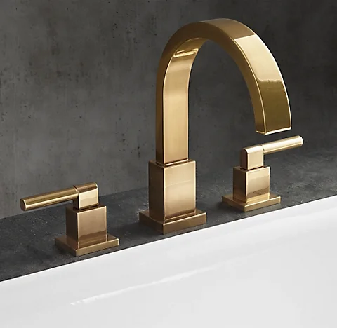
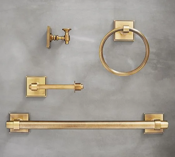

After finally having gotten rid of the ugly brass tones from the seventies and eighties, this time the brass has more of a warm golden tone to it. It is much less that harsh shiny yellowish colour. It is often brushed (hence the word buttery) rather than high gloss. After decades of nickel, satin nickel and chrome, it is nice to see the warm tones of this new brass colour.
No. 2 - Velvet

Source: Unknown
Velvet will be a big go-to fabric this year. Velvet is available in rich jewel colours as well as pastel tones. The jewel tones were getting popular last year and will remain so this year, if not more so. However, we will be seeing pastel tones slowly making their way into decors. The velvets available are rich and saturated in colour with a majestic sheen.
The image above shows not only the richness of the golden sofa, but also the brass finishes I referred to above. The brass standing lamp on the right and the brass base of the coffee table are both reflective of this new trend. In addition, a pastel pink velvet can be seen on the chair to the right. I like how the legs of the chair have the brass shoe (a similar effect as the dipping I referred to above) at the bottom. Not crazy about the green walls though. Not a colour I would specify. I would have preferred to see a soft white wall colour showcasing the furniture.

Source: Unknown
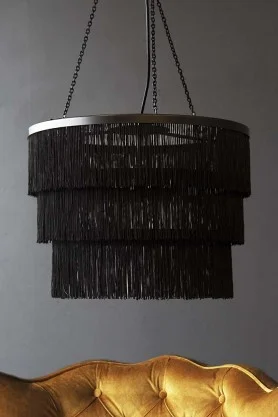
The image above is very dramatic. The deep green teamed with the navy is a striking combination against the black brick behind it. Now close your eyes and imagine that light fixture in the buttery brass finish: a perfect vignette would be the result..
I have always liked velvet in interiors. Velvet fabrics are so saturated and have such an amazing presence. Back in the late nineties I had an aubergine coloured sofa which I loved. After about 12 years the velvet started to show signs of wear and tear and I replaced it with sofa upholstered in a sky blue woven material, not a velvet. While I liked the sky blue colour a lot, the material was much more textured and I found it to be less friendly to my skin. Weird huh… Velvet is smooth and soothing. Just recently I purchased a tuxedo style love seat in deep royal blue velvet with a rich sheen and soft texture. Yep, I am back to the velvet…
Back in 2017 I used an emerald green velvet to upholster benches in the drop in area of a commercial office. Even though typically in the past most velvets didn’t have a long lifespan, today we see velvets that can withstand commercial use. 130.000 rubs is not unusual. See the right image below.


In the new pastel tones we will see soft pinks, yellows and baby blues. Subdued reds and corals. If you like colour there is lots to choose from. I am so happy we are staying away from the boring beiges!
No. 3 - Fringes and Scallops
Yep, yep, yep, the fringes are back!
Oh dear…
Across the design spectrum we are seeing fringes coming back in vogue. Fringes on lampshades. Fringes on rugs and toss pillows. And, dare I say, fringes on sofas…. With the mid century look still going strong, I cannot see fringes on sofas just yet, but they appear to be around the corner. I cringe… I can only hope that the new fringes will be more interesting that they have been in the past. For now I will have to wait this trend out.


Of course, bohemian styles have always accommodated fringes perfectly. You actually expect them! Fringes in a bohemian environment provide an interesting, and often colourful element. It is precisely this type of decorating that needs fringes, that asks for them!

Bohemian Style with Velvets and Fringes. Source: Free People
Scallops are not my favourite decorating element either. But they too are popping up again. The saying that there is nothing new under the sun, is true as far as design is concerned!
I guess both of these two decorating tools are too fussy for me. They don’t provide the clean streamlined look I prefer. Mind you, Anthropologie has a line of chairs in pastel velvets with scalloped backs. These even have brass legs. Very 2019 I might add. And, I must admit these chairs look quite cool. Any of these chairs would be a nice addition to a living room. My recommendation is to use scallops sparingly though.

Anthropologie & Bethan Grey
No. 4 - Colour in Kitchens and Bathrooms
We are moving away from grey kitchen cabinetry. Grey is leaving the scene after decades having been a favorite of many people. My sense is that designers are getting tired of the endless grey colours they have been specifying… I know I am!
Homeowners are becoming more savvy and thus more courageous. Designers are specifying more outspoken colours for kitchen and bathroom cabinetry.

A Modulnova Kitchen (Italy). Contemporary and elegant, I particularly like how the natural light wood softens the look of the black finish.
One colour in particular will become popular: a deep, rich navy blue. Combined with buttery brass finishes this look is very elegant and if done right, will be timeless. The second colour which will gain popularity is black. A third colour which is gaining traction is light or powder blue. Soft, inviting and much brighter than the dark blue and black tones. It will take courage to add colour to a kitchen to the degree that all cabinetry has that colour. It is not for everyone.


For kitchens an updated look can be achieved by adding some colour in strategic locations:


A kitchen island can easily carry a contrasting colour. It is a much smaller object with few doors and drawers. Back in 2015 one of my clients decided to have her kitchen cabinets painted. We choose a soft, warm grey tone BM #2108-50 Abalone. This colour was applied to the cabinetry along the perimeter of the kitchen. The kitchen island received a periwinkle blue BM CC-970 Heather Field. With two crystal pendants over the island it became a jewel in the space. I have lost the photos of this project in a technical glitch, but a sample if the colours is shown below. I am working with the client to get new photos!
A pantry door can stand out by receiving a contrasting colour. Fridge doors can lend themselves to a contrasting colour. In essence, applying a form of colour blocking will achieve and updated look and is less threatening or costly.
Different colours for the upper and base cabinets. For instance, black or navy on the bottom for grounding purposes with the upper cabinets in light grey or white.
Give the ventilation hood a different colour.
Floating shelves tucked in between cabinets or decorating a wall all by themselves can have a different colour than the cabinets.


If you would like to update some areas of your home, but are not ready to tackle the kitchen, a bathroom is always a good start. The majority of bathrooms have only one vanity. It would be easy and less costly to add colour to a bathroom by painting the vanity or installing a new one with an up-to-date colour, to make a start. It is a good testing ground.

The brass hardware, mirrors and faucets work beautifully together with the black of the vanity and the white marble countertop. Source: Unknown.
No. 5 - Black Slim Window and Door Frames
In Europe slim, black window and door frame profiles have been popular for some time and we will see more and more of them here in North America. The galvanized steel frames have a powder coated finish. There are great benefits to this type of window or door frame. According to Crittall, the original manufacturer in the UK, the steel frames provide great security, are easy to replace, never need painting due to the powder coat finish, have low maintenance and are long lasting. All terrific benefits.

Nichba Design - Cool Statement of Minimalism
To top it of, they look amazing. Clean lines and versatile applications, I love this type of window/door frame. The profile is elegant and minimal. I am having serious window issues where I live and replacing my old windows with a Crittall (-like) product would make me very happy. The black finish teams really well with so many other decorating elements. Black fixtures as well as the new golden brass tones coordinate greatly with this type of window/door frame. It will be easy to use any tile style and colour with these architectural elements. A beautiful, classic and elegant alternative to the standard window and door styles.
Maayan Zusman from Tel Aviv (Israel) is one of my favourite young designers. Her style is minimal and sparse. Her aesthetic is clean and appealing. Take a look at the image below: golden toned faucets and hardware coordinate really well with the black tile and cabinetry. I like how the black and white are off-set by the pale beige tone of the floor tile.

Maayan Zusman (Israel)
Expect to see more of any of the above trends this year. Stay tuned for the next article on the most popular colour predictions for 2019.
As always, your visit is most appreciated. Leave any thoughts you have in the Comment section below and I will get back to you. Meanwhile, make it a great week.